

Designing to Help Patients Find Clinical Trials
The Challenge
How Might We make it easier for researchers to enroll patients in clinical trials.
A research organization had an ongoing struggle finding patients to participate in clinical trials that would help develop treatment for rare and problematic diseases.
Meanwhile, the organizations had multiple labs who were competing for eligible patients to participate.
The entire process was difficult for all users, inefficient, and ultimately ineffective
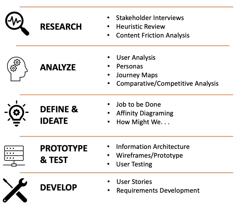
Process and Tools We Used
We were able to map out a research roadmap that took us through the entire product design process, from research to ideation to development to testing to iterative improvements

Heuristic Review
An analysis of the existing site revealed many areas for potential improvement or enhancement, which were sorted into four distinct categories or opportunity
User Experience Opportunities
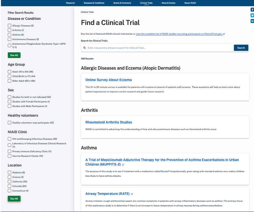
No integrated NIAID Perspective of clinical trials - 4 separate clinics not connected to an NIAID view on the site
Amount and type of content varies from trial to trial
Not all trials are posted to the Find a Clinical Trials section (according to content owners - not all should be)
Extramural trials don't appear on the site
There isn't the overall NIAID perspective of visiting a NIAID clinic
Friction Reduction
Need for online screening forms
URLs are not print/flyer-friendly
Need for a single portal to funnel users into the experience.
Structure and Findability
Clinical trials are separate and siloed within the institute
Increase cross-promotion (between trials)
Clinical trials are not dynamically displayed on other sections of the site
No connection between clinical trials and disease pages
People are directed there from multiple campaigns - flyers, social media
Some trials have their own page and others do not (links to clinicaltrials.nih.gov) with no consistency
Site Maintenance
Pages listing studies by topic or Find a Clinical Trial are manually updated
Some groups post to the Find a Clinical Trial section and others don’t
Mapping the User’s Journey
We developed a current state journey map based on surveys and interviews of patients, clinicians, and researchers. By doing so we were able to:
Identified pain points throughout the process
Identified gaps and areas of opportunity
Highlights and Opportunities
Through the journey map, we were able to isolate pain points and identify where there were opportunities for improvements to:
Increase awareness of available trials
Smoothly navigate the application process
Ease the fear of the unknown
Explaining the experience from first-hand volunteers and patients
Launch & Follow Through - Measuring Success Through Testing and Analytics
Post launch testing and monitoring of analytics allowed us to understand what was working and what needed iterative improvements, beginning the cycle of agile design all over again.
Tracked site usage to monitor:
Overall number of hits to individual trials
Indications that users contacted the clinics directly – hits on active email and phone links
How often are users funneling to clinicaltrials.gov
How often are they engaging with outreach content – videos and testimonials
Direct feedback through Voice of the Consumer tool.
Although this project was primarily focused on improving the experience of Stage 1: Discovery & Enrollment, understanding the complete journey of the user allowed us to include enhancements that may not have been apparent when looking at a single stage.
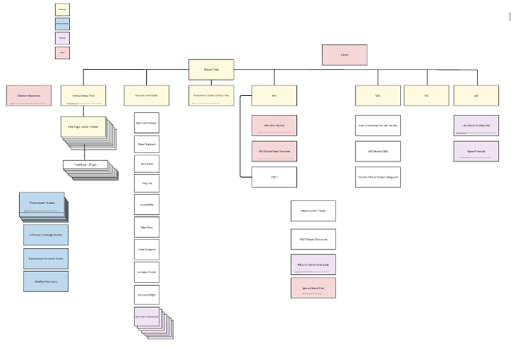
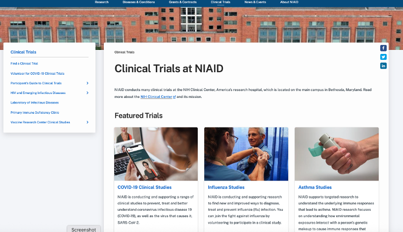
Architecting the Structure
The original site architecture was fragmented and based heavily on individual labs that had the resources to develop the most content. From a patient perspective, this didn’t deliver optimal results. So, we re-structured the architecture of the site. We:
Shifted to “Patient Focused” architecture
Color coordination allowed stakeholders to see what would be featured, what should be deleted, and what needed leadership decision making
Developed to:
shepherd the user through consistent information,
identify the path best suited for their situation, and ultimately
take action to apply for a trial
Wireframes & Prototypes
Annotated wireframes allowed us to review the vision of the site with key stakeholders before development began.
Each block was cross referenced to a requirement or answering a “how might we. . . “ question
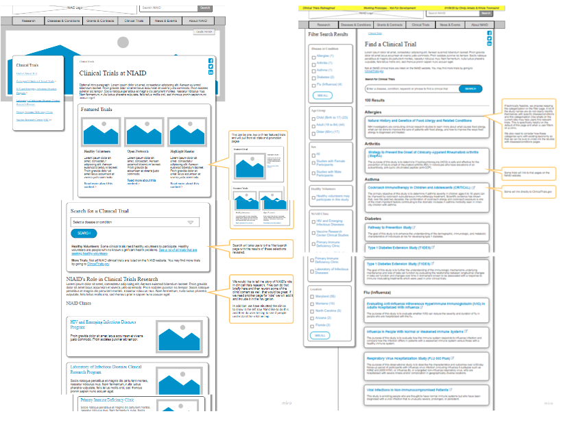
Hi-fidelity, clickable prototypes built out in Figma allowed us to put the features and functionality of the tool in front of users, allowing us to test for friction, content comprehension, task success rates, and overall visual design.
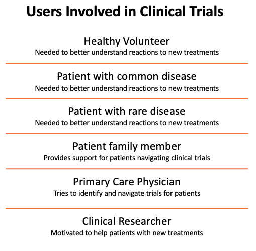
Creating Personas
From conversations with stakeholders, subject matter experts, and users of the clinics and their websites we developed six personas to help us define challenges and begin to develop solutions that might create a better experience for these groups of individuals.
Competitive and Comparative Analysis
Ww reviewed seven government, four private industry, and two academic sites with similar goals of trying to enroll patients in clinical trials.
We could then identify functional wins like:
Robust search features and plain-language filters
Successful outreach programs with social media
Successful “emotional” components like first-hand participant testimonials, visually pleasing images of happy and healthy patients and comforting/welcoming snapshots of facilities and staff.
Great landing page images putting human faces front and center
Plain language navigation labels
Simple and easy Navigation
Simple and clean landing page
Affinity Diagraming User Feedback
We pulled all user and stakeholder feedback and ran it through an affinity diagraming exercise, breaking it down into 5 distinct categories.
This allowed us to create solutions across multiple functional areas, each presenting unique solutions involving different teams and stakeholders
Approach
Structured and informal conversations with stakeholders and subject matter experts revealed some pre-conceived assumptions. More digging into these assumptions revealed new information.
Discoveries
Each lab was funded separately so there was a wide gap in the resources they could contribute.
Not all labs are staffed to post and monitor content.
Labs were willing to work together.
“Rising waters lift all ships.” If we could develop something that would work for everyone, all would benefit